Role: Design + Animation
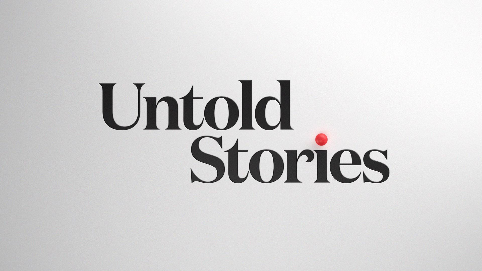
Untold Stories with Netflix

A motion branding package for Netflix.
We partnered with Netflix and our friends at Hornet to create a branded show package - toolkits and all.
The show, Untold Stories, is an episodic series that celebrates unique people, departments, and organization within Netflix.


Title Sequences
"Try to reach for a simple, visual phrase that tells you what the picture is all about and evokes the essence of the story" - Saul Bass
The first two elements created for the package were the title sequences.
In storytelling, all protagonists find themselves on a journey - they take a path often filled with twists, turns and conflict.
This inspired the motif seen throughout the entire package: the pathway.

Motion System
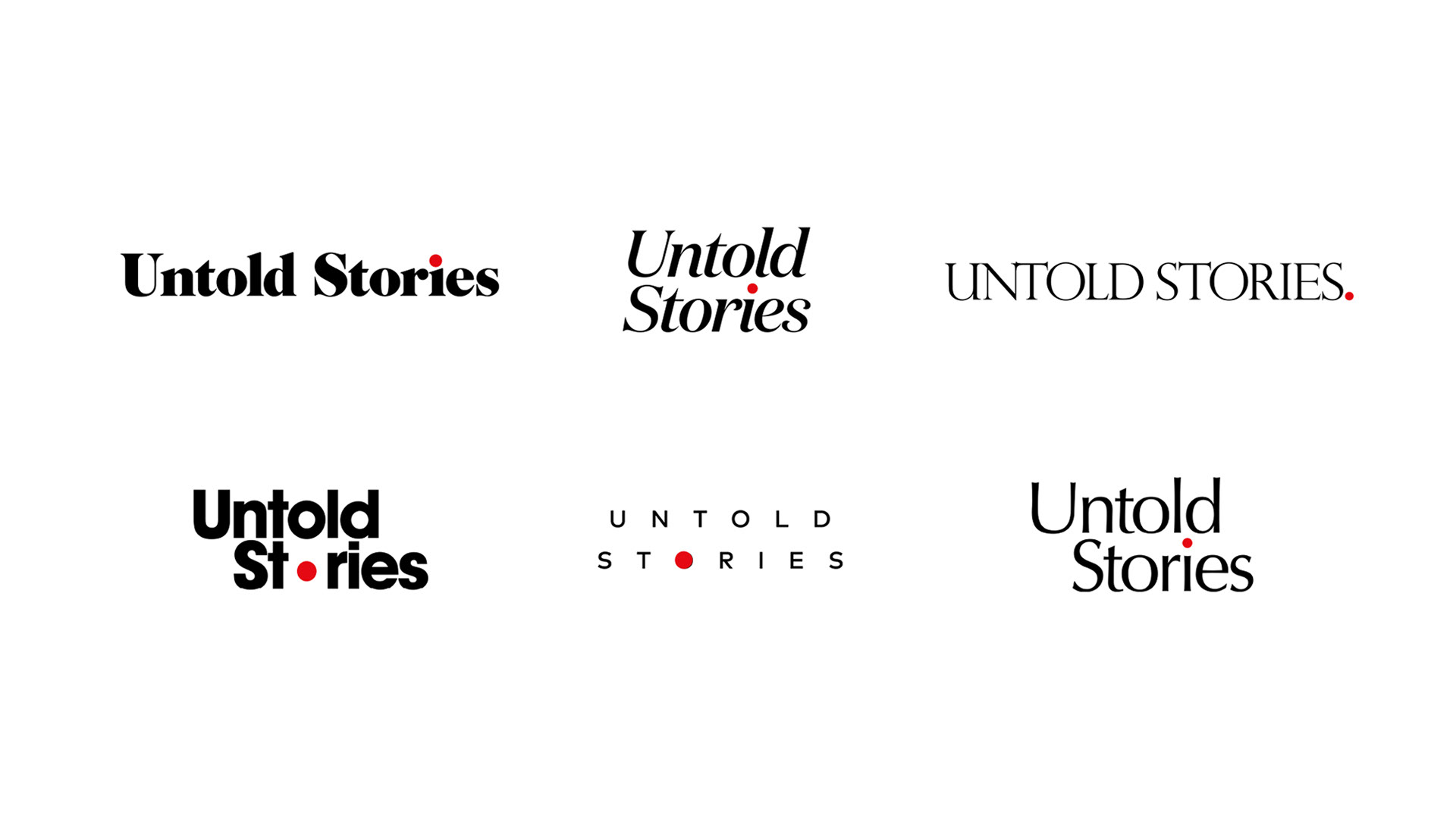
Wordmark:
After exploring a number of options for the Untold Stories word mark, we used Domaine Display due to its human, elegant, optimistic qualities.
This was also complimentary to their custom typeface, Netflix Sans.
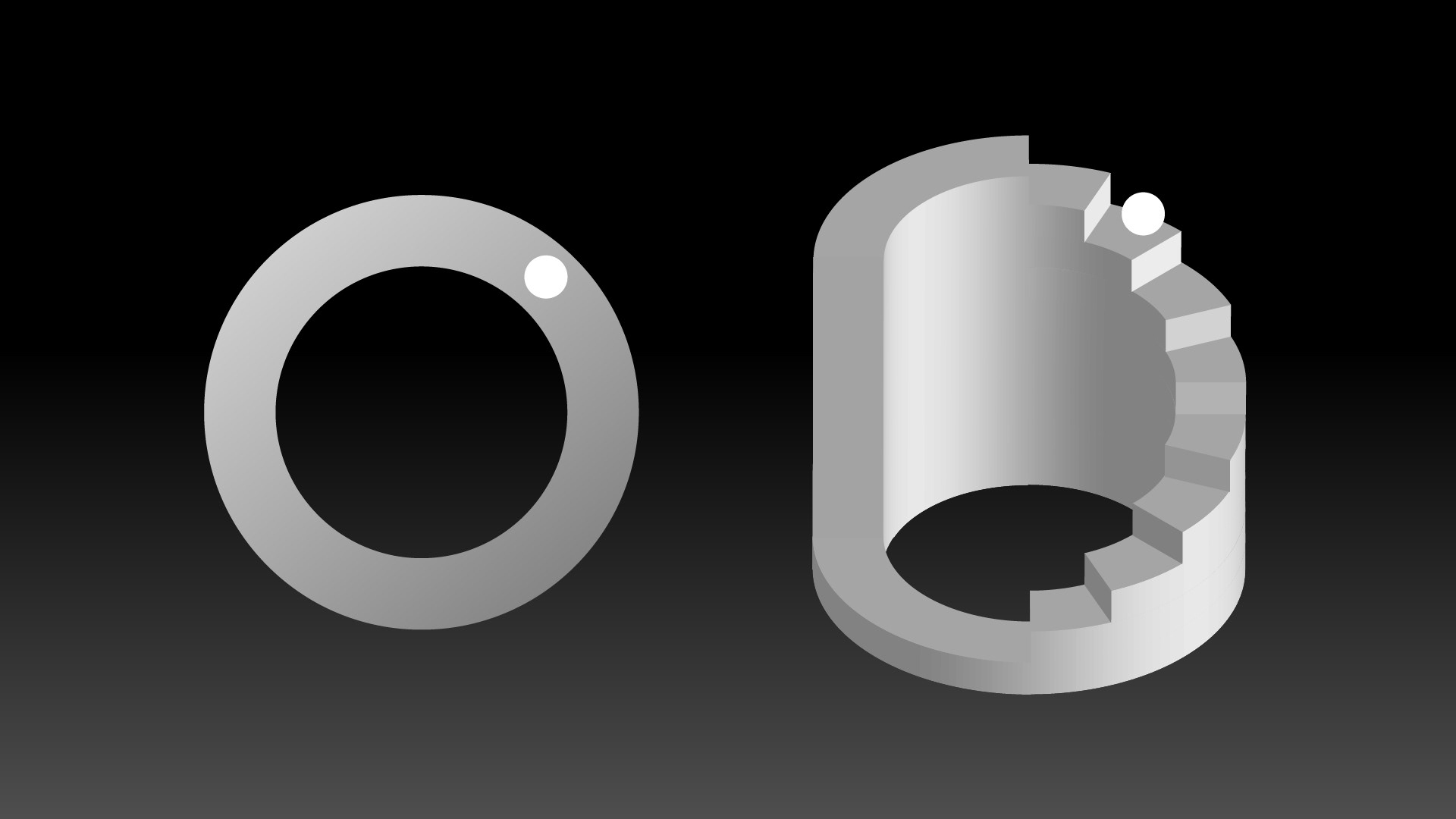
Symbol Resolve:
We had to find a memorable way to encapsulate a journey on the symbol itself.
The visual solution is simple and concise: the path and the hero become the mark.


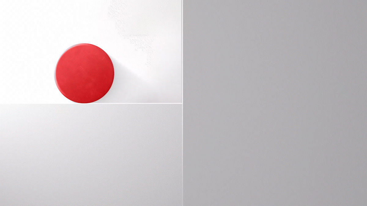
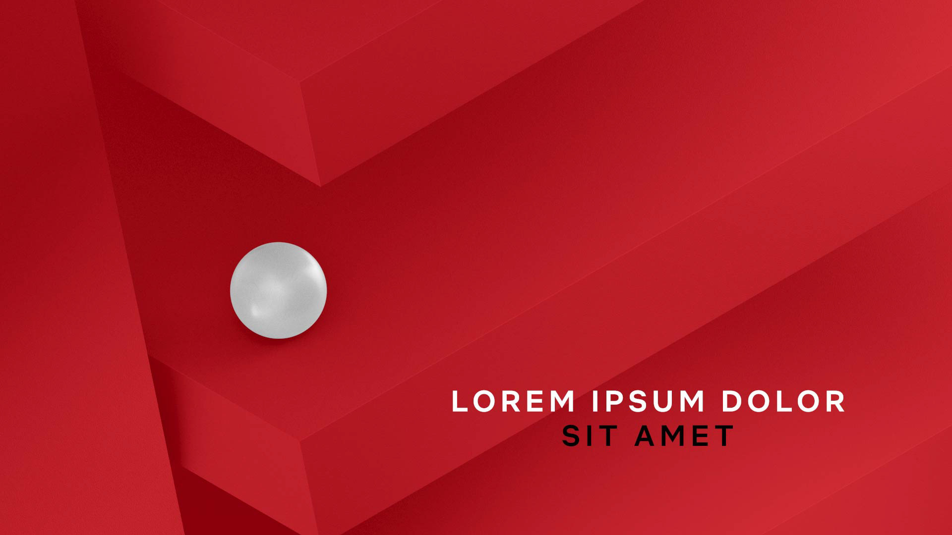
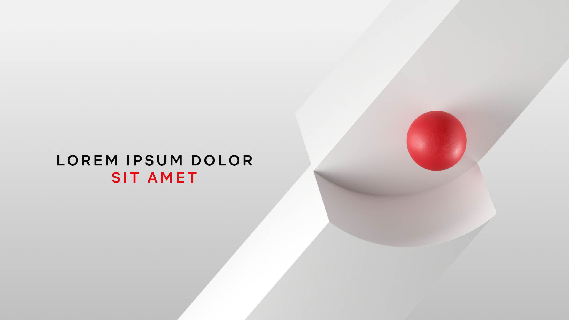
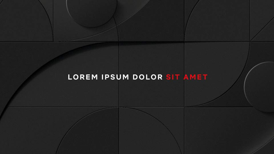
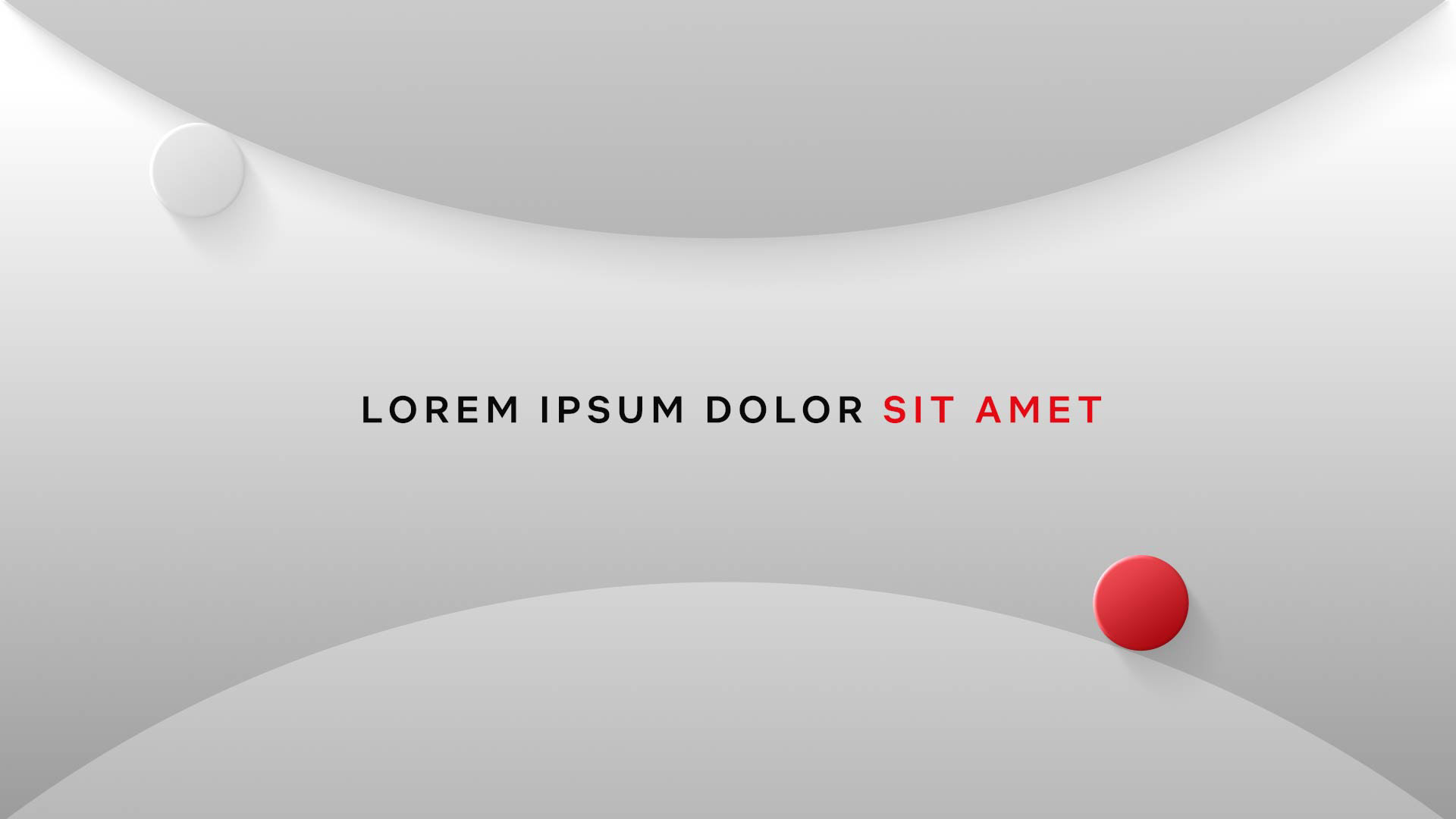
Backgrounds:
Impossible shapes and pathways are the core the Untold Stories visual experience.
Backgrounds were designed as impossible landscapes: mazes, steps, waves, and more.
7 backgrounds were created, in 3 different colorways.


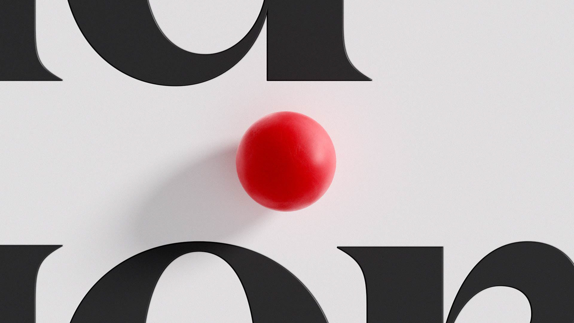
Title Cards:
The package also included sets of title cards, which were framed as close ups.
This created a wide negative space, which in turn, maximized legibility of the type.
Visual Exploration

Initial explorations of pathways took us to a world of impossible objects and Escher-like mazes.
Designing in greyscale allowed focus on form and composition from the onset - later integrating type, to be utilized in the overall brand package.